During October the YouTube channel Midwinter Minis ran a painting competition. Dubbed #Sporktober (a portmanteau fusing Spook, Ork and October) it offered prizes for painting Undead or Ork models in a vibrant and colourful 1990s style. I hadn’t painted in that style since the 90s (when my painting was, quite literally, childish) and I had never entered a painting competition, so I decided this was a perfect opportunity to amend both!
The greatest obstacle for me was that I had two work trips during October, which effectively took me out of the country for two working weeks, reducing the time I had available for anything else. I also misjudged exactly when these trips occurred relative to the submission deadline, because I am very smart. The end result of this was that although early in the month I’d developed a clear plan for what I wanted to paint and assembled my chosen model, when it came to the actual basing and painting I had exactly three days to get everything done. Well… why not make a challenge more challenging, eh!
The basic idea was to follow the 90s colour scheme for the Snakebite ork clan, particularly the old Boarboyz. I also knew that I wanted to break out some of my very old 1990s Citadel paints, at least for some base coats. And finally, I wanted to include a simple base decoration that in some way recalled the period – eventually arriving on the idea of making a miniature spiky cactus, something familiar to anyone who read White Dwarf in that decade.


Beyond that, I resolved to try and be a bit freeform and just go with my gut, rather than trying to plan every small detail in advance.
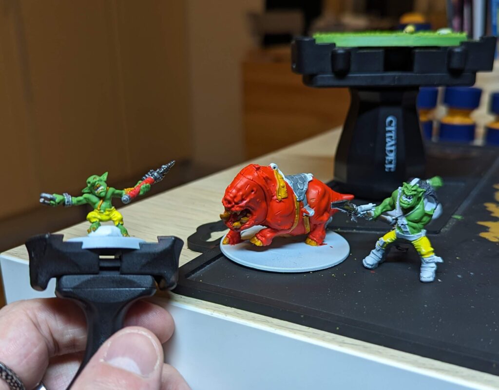
On the first day I applied some texture paint to the base – Stirland Mud, the only one I could get at short notice – and after encouraging that to dry rapidly, I primed everything. I’d also made a test cactus out of cheap modelling clay and cocktail sticks a few days before, and it had dried/cured long enough to also be primed. As I had no time to make a non-test version, the test version ended up being final. I work in software development, and this is a remarkably similar pattern to what tends to happen with prototype code…
I of course primed in white to encourage the vibrancy of everything that went over the top. By the end of day 1 I had laid down two thin coats of several of the base colours. The Citadel paints were surprisingly good to work with, thanks to my vortex mixer doing the hard physical work. The toughest part was getting the lids off. Even after the thirty year crust was removed, I was reminded of how terrible these pot lids were. I had a tiny blister by the end of day 3!

Day 2 was spent laying down all the other base colours, and starting to experiment with a few highlights on the metallics, the gretchin’s skin, and the furs. There’s not much more to say, except to note that the base got a coat of Goblin Green and a drybrush of Sunburst Yellow. Classic!
Oh, and the small cactus got several layers of watered down PVA and two layers of flock. This was some actual flock from the 90s as well, stored in a little Flora margarine tub from the same era…
I was happy with the way things were heading, and the vibrancy of the painted model was already striking. Yet I only had one more day to go, and on that day I needed to take everything to the next level with highlights and shading. The good news is that this is one of the parts I find most fun. The bad news is this is one of the areas of painting I’m least experienced in and confident at. Who needs comfort zones anyway!
The skin for the ork and the squig received by far the most attention, particularly around the face and shoulders. The gretchin got a lot of attention too as he was perfect for trying stuff out on before I worked on his bigger cousin. More so than with anything I’ve previously painted, I tried to think about focal points and concentrating my efforts around them. I’m most pleased with the ork skin, which got many layers of highlights, building up with mixes of the base colour, lighter greens, and yellows, plus a few layers of shading with browns and purples mixed in with the green. Around the ears and nose I also glazed a little pink and magenta. I think the highlights could still go higher, and more shading would be great too.
The squig’s skin was harder. I know from experience painting Blood Angels that building up from red whilst keeping it readable as red is a challenge; it’s easy to end up with something that reads as pink or orange. This is particularly a challenge where you can’t really just edge highlight. In the end I settled for adding contrast by shading in a darkened red underneath folds of skin, in the scratches and scars, and beneath the adorably pudgy body. I was more sparing with highlights, and used a mix of pinks and oranges.
I used the base colours mixed with black to do a little ‘blacklining’ to better define where some parts meet, such as the leather straps on the squig’s back and the ork’s torso, and to give the boots more definition. The metallics got a simple wash with modern Nuln Oil and a little Agrax on the lower leg. Most of the other highlights speak for themselves! In the last photo below you can see all the paints used, except the texture paint and the washes which I forgot to include in the shot.
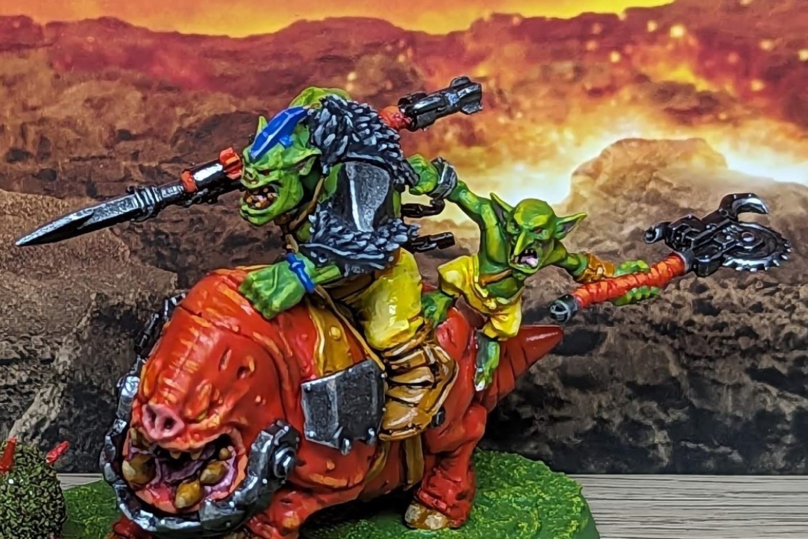
If I had more time, the thing I would have most liked to do would be to make a custom back banner. I’m not sure where I’d put it – one idea was to have it speared into the ground as more base decoration – but I would have loved to make a classic Snakebites banner, like those visible on the old box art above. I would also have liked to do a bit more with the eyes, enhance the metallics a bit more maybe with some patinas of different colours, and build up more contrast all over the model. A better cactus would have been great, too.
The model also didn’t get varnished before I took the photos for the competition. A layer of matt varnish would have removed the slightly odd glossy shine from the yellow fabric, and targeted gloss varnish would have accented the squig’s slobbering maw. Alas, I had no time as I needed to pack, eat and sleep before getting up at 4am for a flight. I will be adding varnish soon, though in tribute to the competition entry I won’t make any further changes.
Other than stuff missed due to lack of time, my main self-critique is that my brushstrokes are still visibly a little clumsy. This isn’t obvious in some of the photos as digital image compression can be quite flattering to them, but the highest-resolution original photos show it clearly. I’m fine with this – I need more experience and practice with diluting paints and brush control, particularly when it comes to layering and glazing colours, and that will come with time.
Overall I’m proud of the results achieved, with actual painting time being maybe 20 hours across 3 days. It was a fairly intense experience but also a lot of fun, and I’m beginning to realize that I might enjoy this kind of painting – focusing on a single model – a lot more than trying to knock out squads or armies. Bad news for all the unpainted squads and armies I have!
An epilogue: the winners were announced, and I took a runner-up spot! I’m very pleased indeed with this. It’s a real confidence booster, and I’m already thinking about what I do next…


