
Since the start of the year I’ve been attempting to paint every day, even if only for a few minutes – and, in truth, on most days it has only been for a few minutes. But that’s fine, and I also forgive myself on the days when for one reason or another I don’t paint at all. The point is not really what I do each day; the point is building habit, and breaking down mental barriers that make me imagine things as more difficult than they really are.
Anyway! What I’ve been working on through January has been some additional detachments for my Imperial Fists. These are all units that featured in my last battle report, but at the time they were “reinforcements from allied White Scars”, i.e. primed in white and otherwise unpainted. I’m currently working on the first of two Mastodons, though today we will be looking at a Xiphon Interceptor and a trio of Kratos heavy tanks.
I didn’t write about the process of building or painting my initial forces for the game. At the time I was experimenting with using a kanban-style method of planning and tracking progress. It worked pretty well, in that it helped keep me focus and was a convenient way to visualise progress and record notes on how I intended to paint each detachment. I haven’t used it since, however, as a side effect of my struggles with my day job and not wanting to bring project management home with me. As a result my painting since has been unplanned and ad hoc, and on reflection I would benefit from bringing more planning back into my process. Well, that’s a valuable learning experience in itself.
Here’s a work in progress shot of the Xiphon.
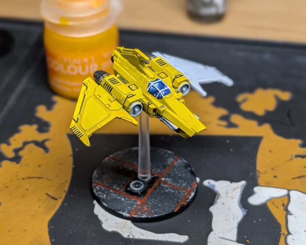
I used Black Templar contrast paint to ‘black line’ the recesses before painting anything else, with the intent of giving the model’s detail more definition, which some of my previous 8mm scale models lacked. This is untidy in places, as a contrast paint is a lot thicker than a wash, but the intended effect works. You can also see that I’ve tried to paint the canopy in a way that suggests reflection, and I am happy with that. Credit to Hobbius Novitiate over on Youtube.
Imperial Fist contrast paint gets applied over everything else. I aim for an even coat, but even so you can see where more pigment has clumped producing orange spots. You can also see where my priming was shoddy and there are brighter splotches that show through. Sometimes I just don’t care enough to go back and try to fix stuff. I paint Legions for play, not display, and I’m slow enough at finishing models as it is.
The base is painted the same way I’ve done all my bases for Legions. A dark grey prime, then stippling two successively paler greys over that, focusing around edges and raised areas and near the recesses. Finally, the recesses get a generous serving of Magmadroth Flame contrast paint. Messy is fine: it contributes toward a glow effect. What is this supposed to be? Who cares: it looks cool.
(As an aside: outside of the contrast range I do use Citadel paints, though I’m more a fan of Vallejo and have recently been making use of my Ultracryl paints. But when it comes to washes and contrast or speed paints, it’s Citadel all the way – straight out of a pot is best, thank you very much, and they have some lovely vivid colours in the contrast range. Painting yellow when it is not Imperial Fist contrast paint is not a fun experience for the average painter like me!)
Here’s a shot of the finished model.
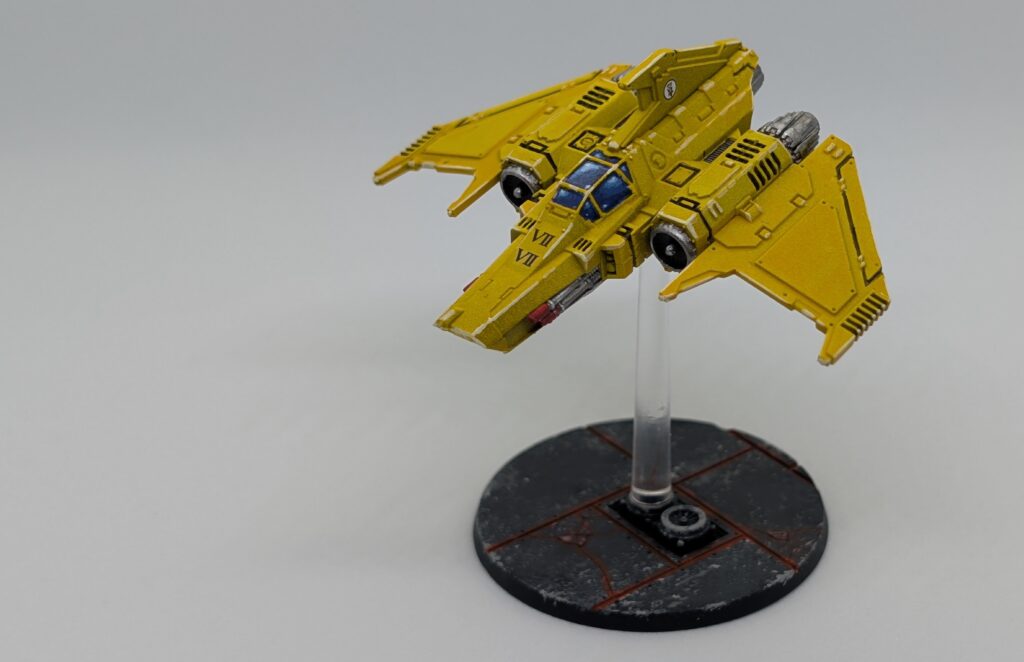
The main changes since the WIP shot are I’ve finished picking out the metallic details – engines, turbines, lascannons – and added some transfers. The multiple VII transfers are a reference to the theme of the army, which is 7th chapter, 7th company of the 7th Legion, the 7-7-7s. I’ve also applied a black wash to the engines, then highlights: silver over the gunmetal (something I can rarely notice myself, but it’s there), and an ice yellow elsewhere.
My favourite parts of this model are the cockpit canopy and the way that it pops, being generally very bright – which is what I’m going for with my Legions models.
What I am less keen on:
- The inconsistent coverage of the prime and the yellow over the flatter panels;
- The slightly ugly edge highlights – yellows and off-whites I find really hard to work with and find a good consistency;
- The lack of deeper contrast besides the black recesses. I did think that planes would be less grubby than ground units, but more contrast would be nice.
I can take some lessons from this experience and apply them to the larger flyers I’ll be painting soon. (A Thunderhawk and perhaps a… a… Stormraven? Firebird? No, a Fire Raptor! That’s what it’s called!)
Here’s a WIP shot of the Kratos detachment, which is not far off done at this point.
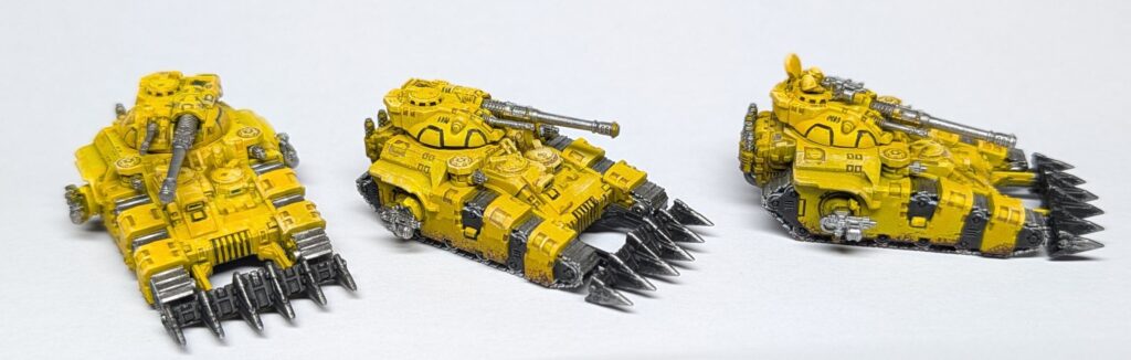
Similarly to the Xiphon, I’ve used Black Templar to blackline recesses. There were fewer such areas on the Kratos, and I’m already experimenting with using a wash instead, as the recesses on the turrets here don’t look great with the Templar approach. I’ve also tried to address the lack of contrast with the Xiphon by using Agrax Earthshade to add more depth around various recesses, and with for example the inset panels on the track armour I was very careful with my placements. I think it works. The models do look busy, but they’re very detailed.
I’ve also tried something new here. I’ve taken a nice earthy red-brown and stippled it with a sponge around the track armour. It’s subtle, but it grounds the vehicles a bit, and makes them look a bit less clean. I’ve also sponged metal over black on the dozer blades.
Let’s jump ahead to the finished models…
I doubled down on the mud effect, applying it to the dozer blades as well. I applied more ice yellow highlights, using some drybrushing here as well as edge highlights because of the density of detail in places. Metallics got highlights and washes again. The tiny viewports were done in blue, but you can’t tell; oh well.
Whilst painting these tanks I was really unhappy with them for a while. I thought the yellow looked shit and painting the metallics – which I did before the yellow – took forever, and despite that I still got the paint where I didn’t want it. Happily, I pushed through, and during one longer session (kudos to the MS Paints community hangout) I was more cheerful after adding more contrast and character.
I’m happy with the end result here, especially given my earlier displeasure. They look cool overall, even if no part of them really stands out – except perhaps the sponged and stippled areas, which is a technique I’ll make more use of. Texture!
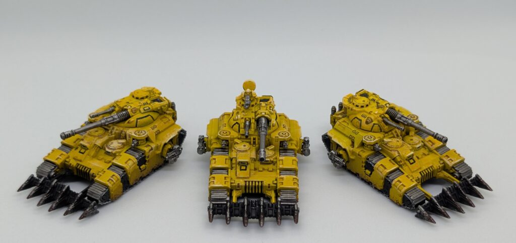
Lessons learned from these…
- Painting the metallics after the contrast paints is probably smart for models like these. At least with the sponsons. Sure, it’s harder to fix mistakes when they stray onto contrast, but whatever, not the end of the world.
- I already mentioned I’ll try a wash/shade instead of a contrast for black lining on my next model.
- These tanks had similar issues with a bad prime job as the Xiphon. I’ll hope to not repeat that again; unfortunately, I am pretty shit at wielding an airbrush.
- These tanks don’t have any spot details. I usually pick these out in red, but opted not to as I couldn’t see a detail I wanted to do this with. Maybe I’ll do this for the fourth Kratos I have to paint, which I use as a tank commander.
- It’s not escaped my attention that there are unpainted areas peeking out between the tracks. Oops. I’m pre-emptively addressing this on my next tracked models. I’m living with it on these guys. They are getting varnished, and then they are done with.
One final thing to note: in an effort to improve and streamline my model photography, I bought a cheap lightbox. I used it for the finished pictures here, whereas the WIP shots were taken on my paint desk using my painting lamps and a piece of paper. It’s pretty obvious that the WIP shots are a lot brighter, despite not being drowned in LED lighting. I think the issue is that with the lightbox I don’t have light behind the camera, but setting up the lightbox is hard. It’s a cheap GSW thing which somehow requires two separate, multi-chained USB cables to be plugged in somewhere, and they constantly disconnect. It’s more of a hassle to set up than spending ten minutes fucking about with positioning lamps and clipping A3 sheets of paper in place. Honestly, having used it I’d rather not own it, but since I’m a dummy and paid for it I’ll see if I can make better use.
For the photos themselves I’m using a Pixel Pro phone, Portrait mode, and 50mp shots. I’m trying to get the camera as close to the models as I can without starting to see lack of focus outside the main focal point, which unfortunately tends to be just outside the lightbox itself, hence the problem where the lightbox shots can be quite dark. Photography and lighting aren’t my hobby, but I’m trying to learn and improve.